
This page catalogs some of the special layout and content guidelines that we’ve used in the demo using the Visual Composer plugin. None of the following tricks are required for theme use of course… in fact, most of these are simply personal embellishments and insightful uses of the Visual Composer drag & drop layout builder… but just to be safe, we’re logging them here so no one gets confused!
Keep in mind that you can always import all of our demo-data (posts, pages, etc.) if you want to get your hands on the actual content!
Visual Composer: Drag & Drop Layouts, Front & Back End
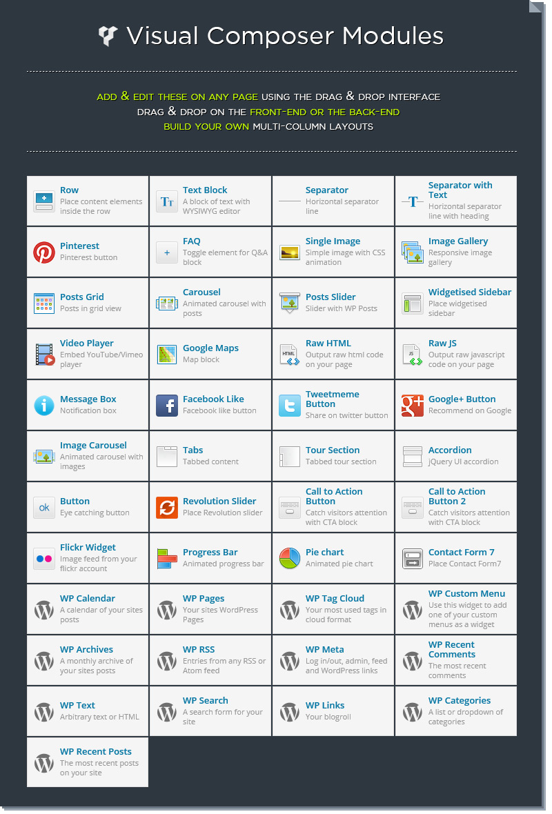
Visual Composer comes pre-integrated into the theme… we’ve even included a handful of our own custom twists on their modules & support for other premium plugins via the module “drag and drop” editor. Check out the full roster of modules here.
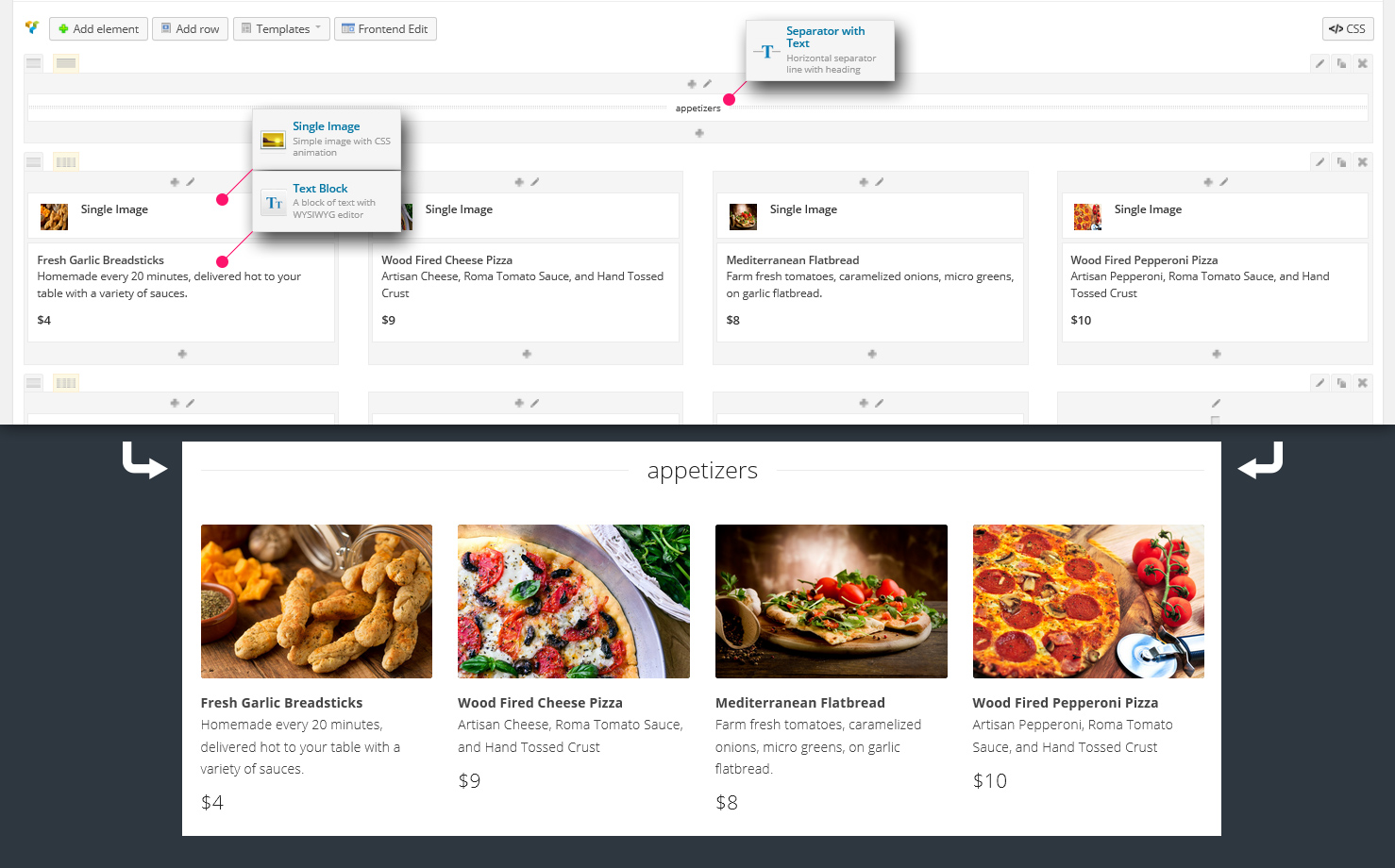
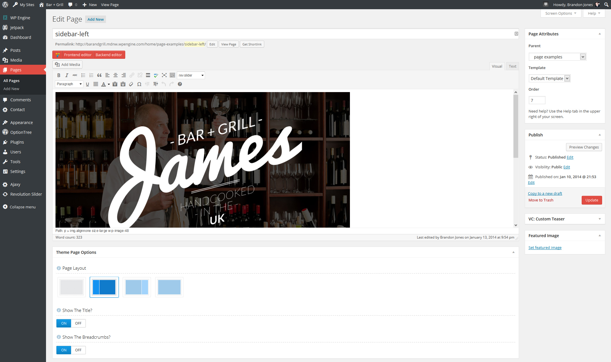
Layout Example: Building The Menu Page
The restaurant menu page is flexible and very easy to set up and customize for your own project. The demo’s menu page is built using simple Visual Composer components, specifically, the “Seperator with Text”single image” module and the “text” module.
Review the following image to see how the layout was built:
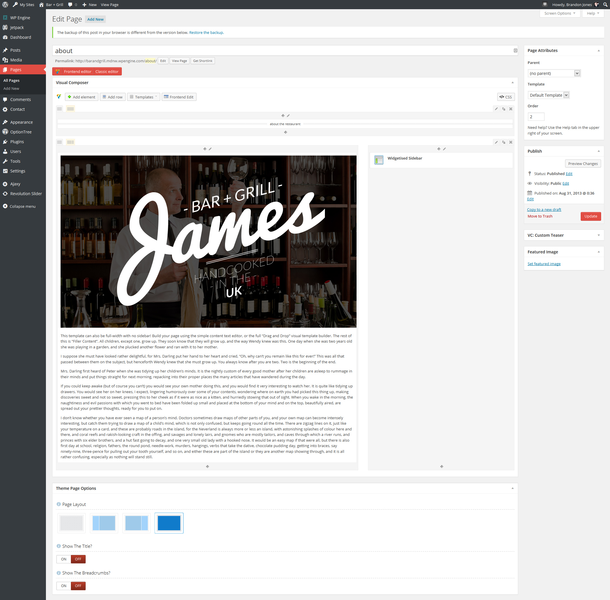
The Front-End Drag & Drop Editor
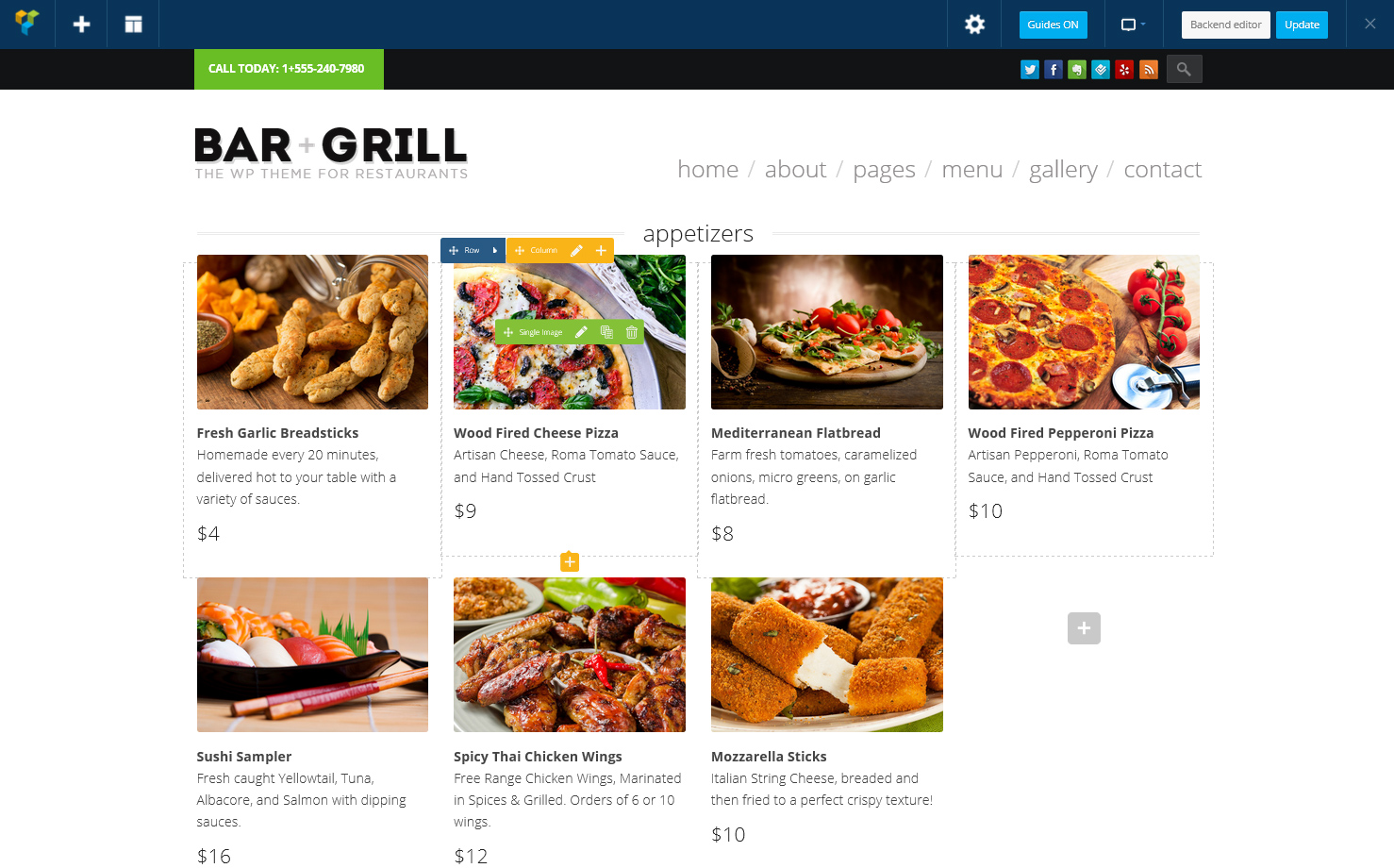
You can also choose to build your layouts using the “frontend” editor, which allows you to see the actual content that you are building as you do it. Here’s what the menu page looks like for instance:
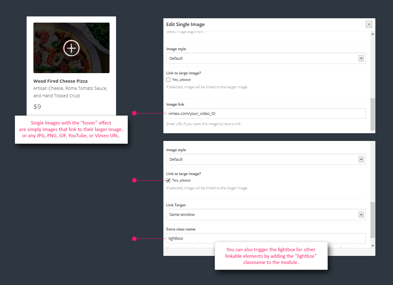
Using Visual Composer: Hover Images & Triggering the Lightbox
Visual Composer gives you a variety of ways to trigger the lightbox with *some* elements, but not all of them… so we’ve filled in the blanks for you. There are three main ways to trigger the lightbox, and getting the “hover” effect on images is easy (and we’ll likely expand this feature soon!):
Full Width Page Titles vs. Default Page Titles & Breadcrumbs
In the demo, we’ve opted to hand-build several pages’ title areas inside Visual Composer instead of using the default Page Title and Breadcrumbs. You can choose to go with either method, or both. Here’s what it looks like for each:
Default Page Title & Breadcrumbs: If you want to use the default theme title & breadcrumbs, you can simply leave everything as-is and just toggle the “show the title” and “show the breadcrumbs” options on and off. Use the Page Layout options to decide if and where the default sidebar will appear. Review the following image, and note the “Theme Page Options” values down near the bottom:
Custom Full Width Title: If you want to have the full-width page title with lines on either side, you must select the “full width” page layout and manually add the full-width title, the content column, and the sidebar column with the dynamic widget area added.
Review the following image, and note how the title has been manually added as a “Seperator with Text” module, and the default page title & breadcrumbs options are turned off down below (in addition to the full-width layout being selected to avoid double-posting the sidebar).
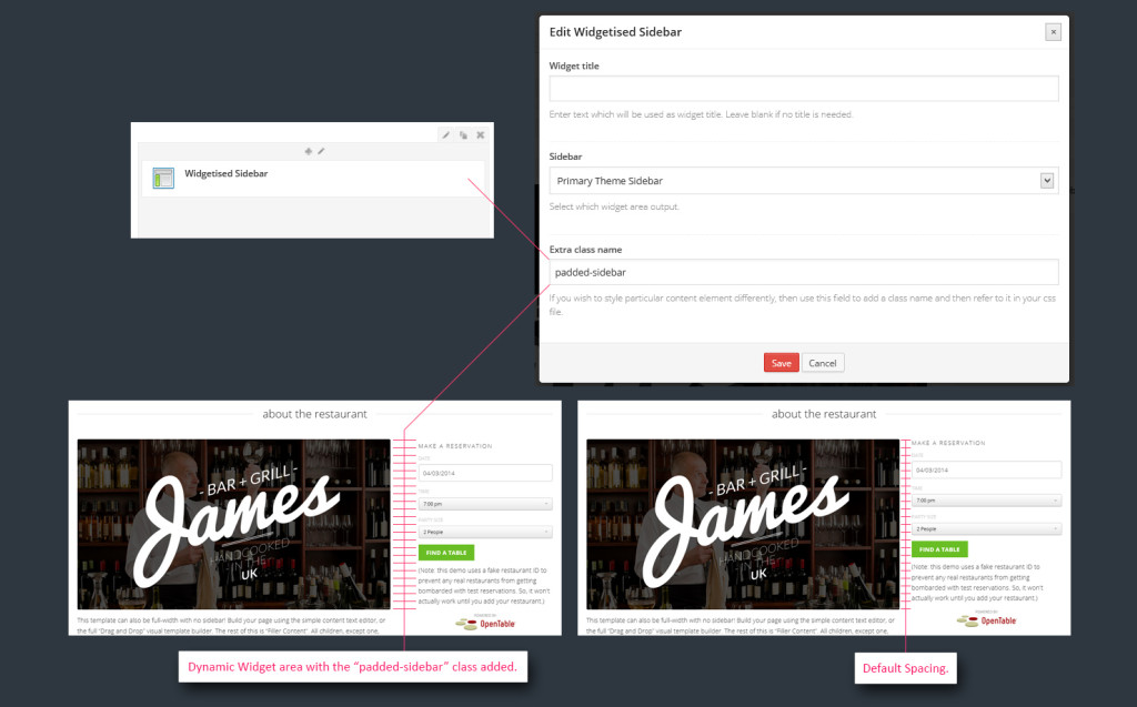
Padded Sidebars Spacing vs. Default Spacing
This only applies to page layouts that are using the “custom page title” method mentioned above.
So you’ve manually added the sidebar space in your manual right column. Visual Composer’s grid of columns fits together nice and tight… but sometimes it’s too tight. We’ve added a custom class that you can assign to any columns or modules where you want extra padding. Just add the “padded-sidebar” class, as shown here: